FIFA Mobile UI Redesign
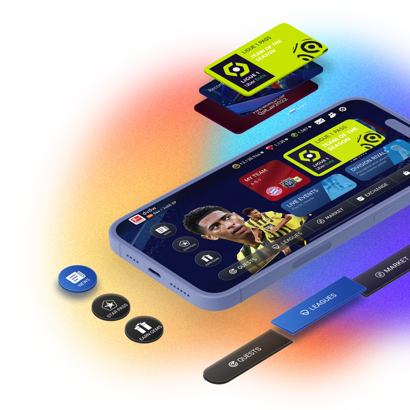
The main task was to update the interface of the game, because at that time it was already outdated, as well as the introduction of a new simplified view of launching matches and training. Special attention was paid to simplifying the interface and getting new positive emotions from interacting with it.
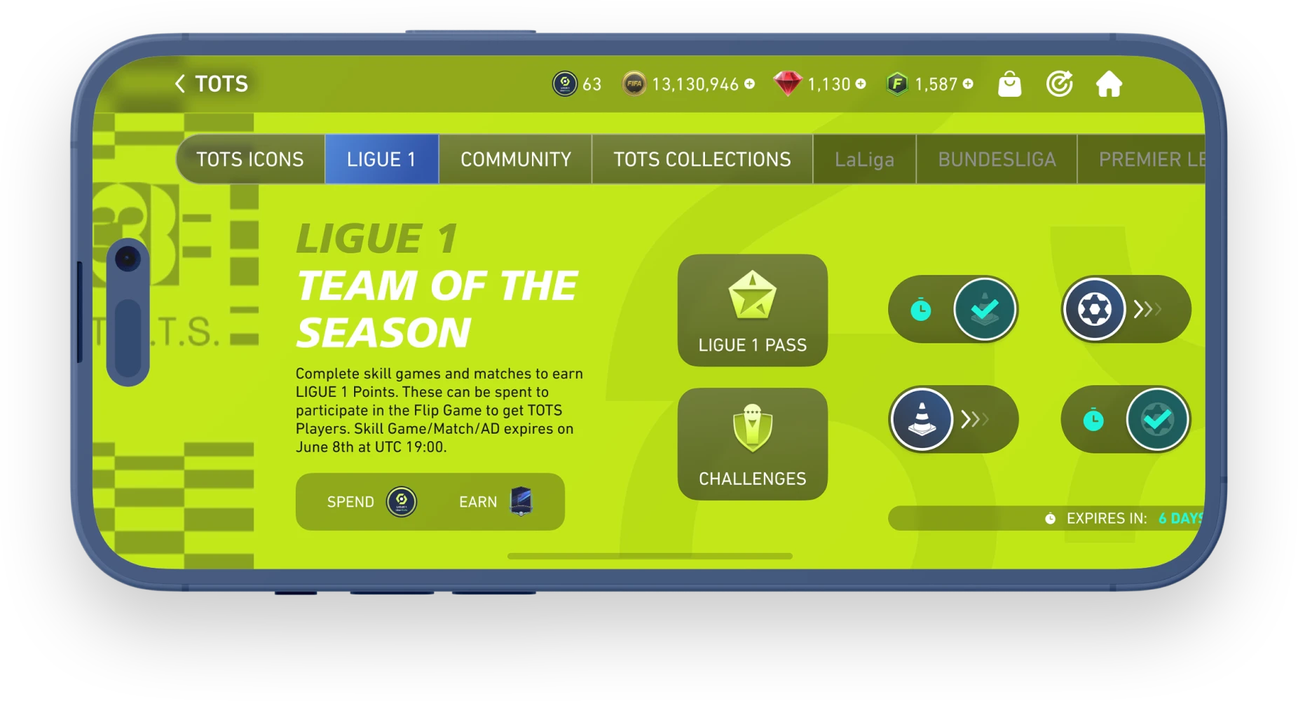
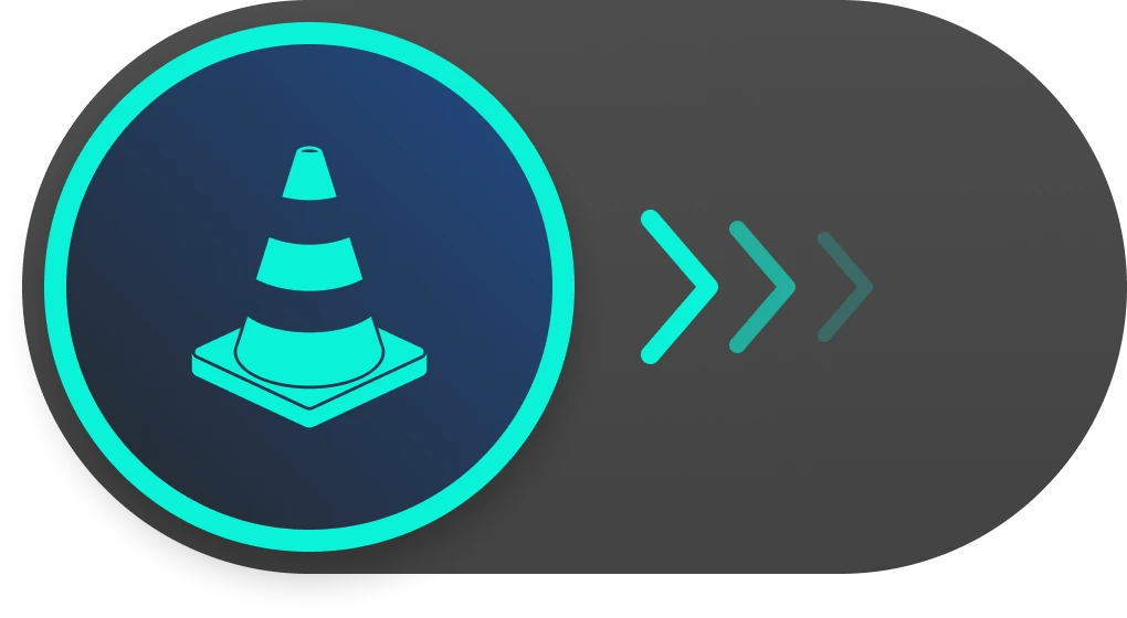
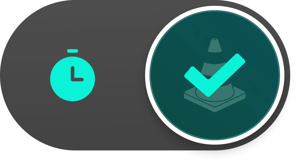
The way you start a challenge has been rethought. Now you can quickly and easily start the game by simply swiping right on the switch. With a single tap, the familiar pop-up window on the right with information and rewards reworked to a modern design appears.

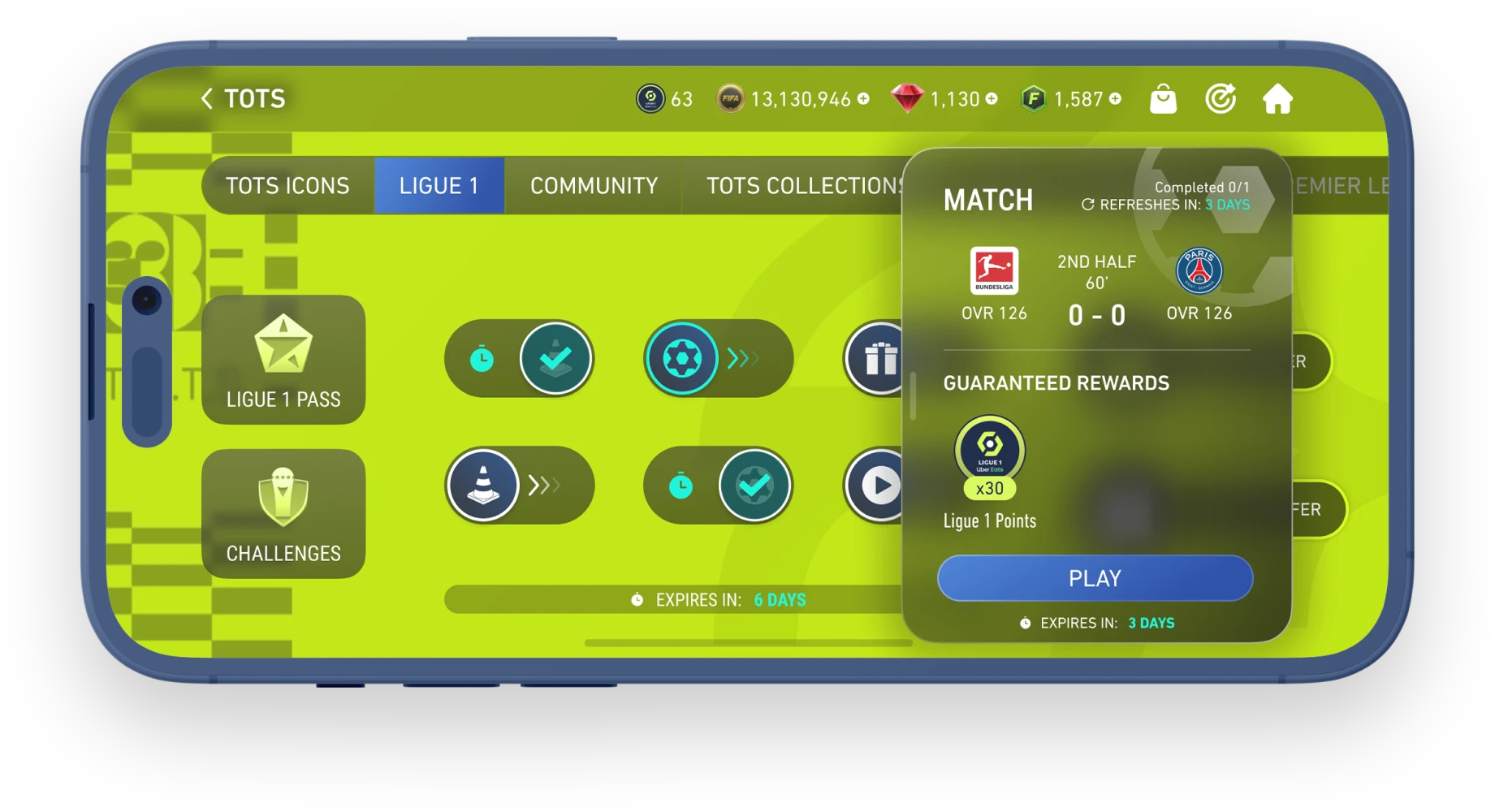
A smart navigation pane that contains current and completed events. Completed events become inactive and are moved to the right side of the panel, while active events remain in the left side. In this case, inactive tasks get a dark background and text shade, which visually makes it clear that the task has been completed.
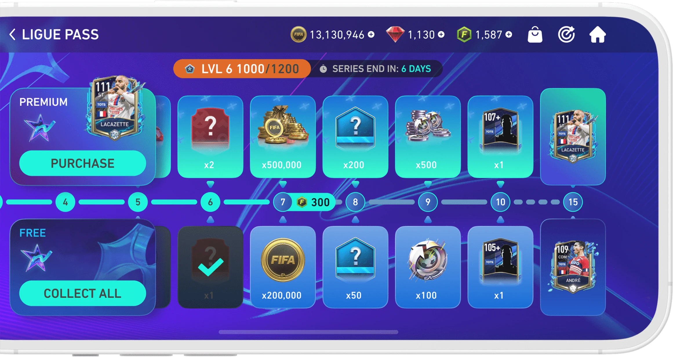
The achievements and rewards screen has also been redesigned. It has been given a modern look with rounded corners, which is seen throughout the interface. The “Collect all” button has been moved to the free rewards box. This allowed the content to take up more space on the screen, as previously the button was located under the rewards path.
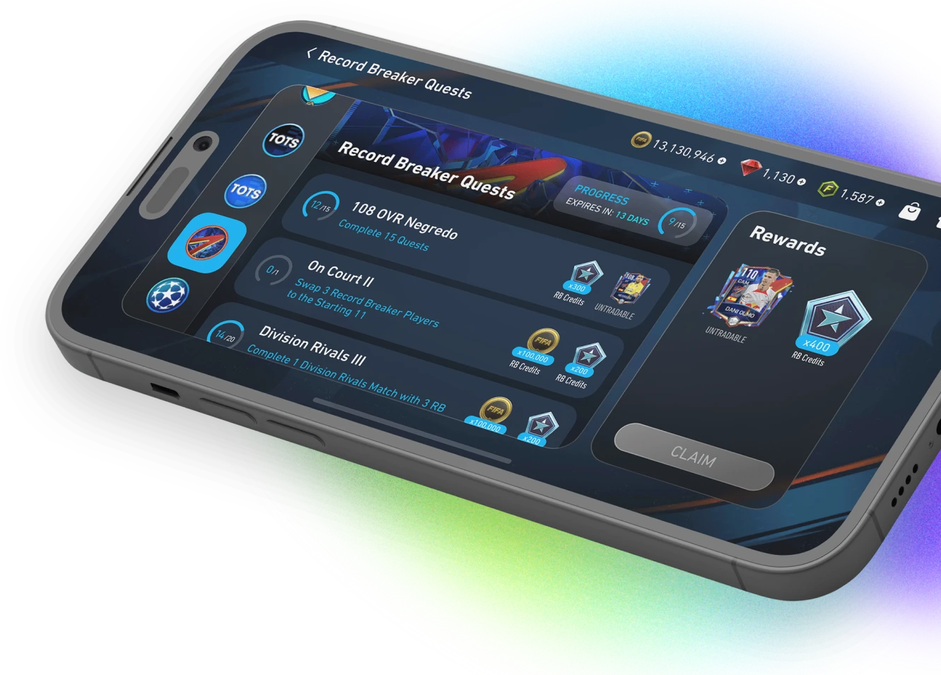
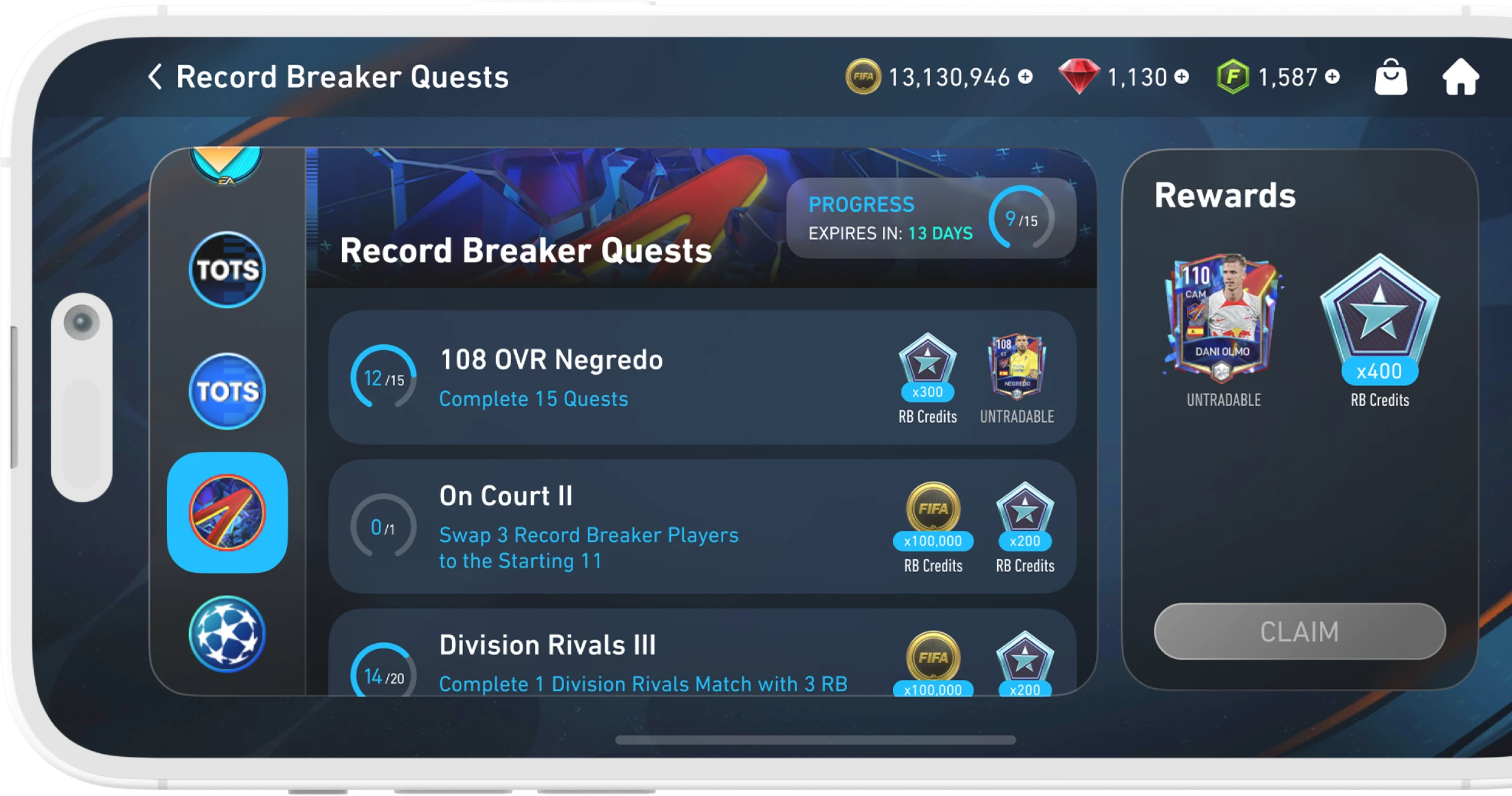
Quests are grouped by program, which are located in the left tab. The quest list has been rethought and now each quest has a progress bar for quick and easy understanding of the quest status. On the right side of the list are the rewards for completing the quest. The main reward for completing the quest program is highlighted on the right side of the screen.
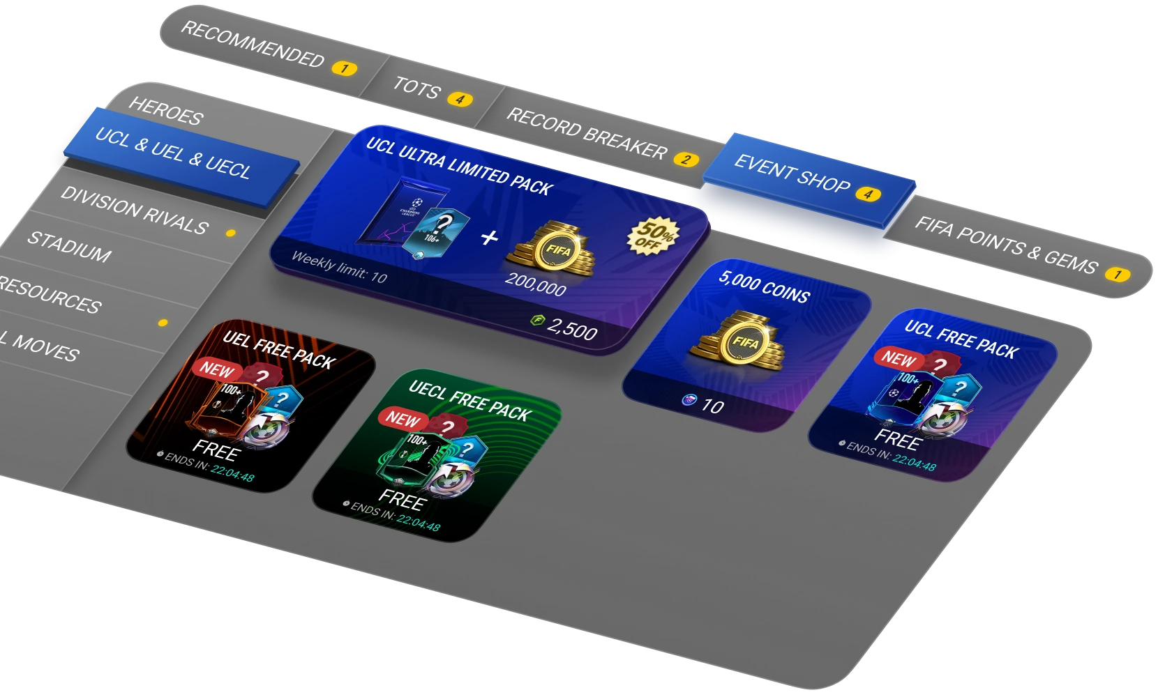
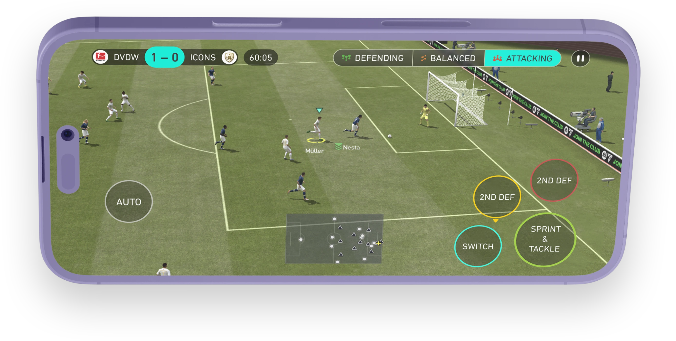
Following the general new style, the interface in the match was changed. It has rounded corners and smooth shapes. The current score in the match is highlighted and cannot be missed. Team names are no longer cropped like in the original interface.
If you would like to contact me to discuss the design of your project or for any other reason
