Design of online door store
A design project for the online store of doors of Pantheon company. Quite specific, because the company has many series of doors, variations of doors and accessories for them. One of the conditions was to use orange as the main color of the entire online store.
Task
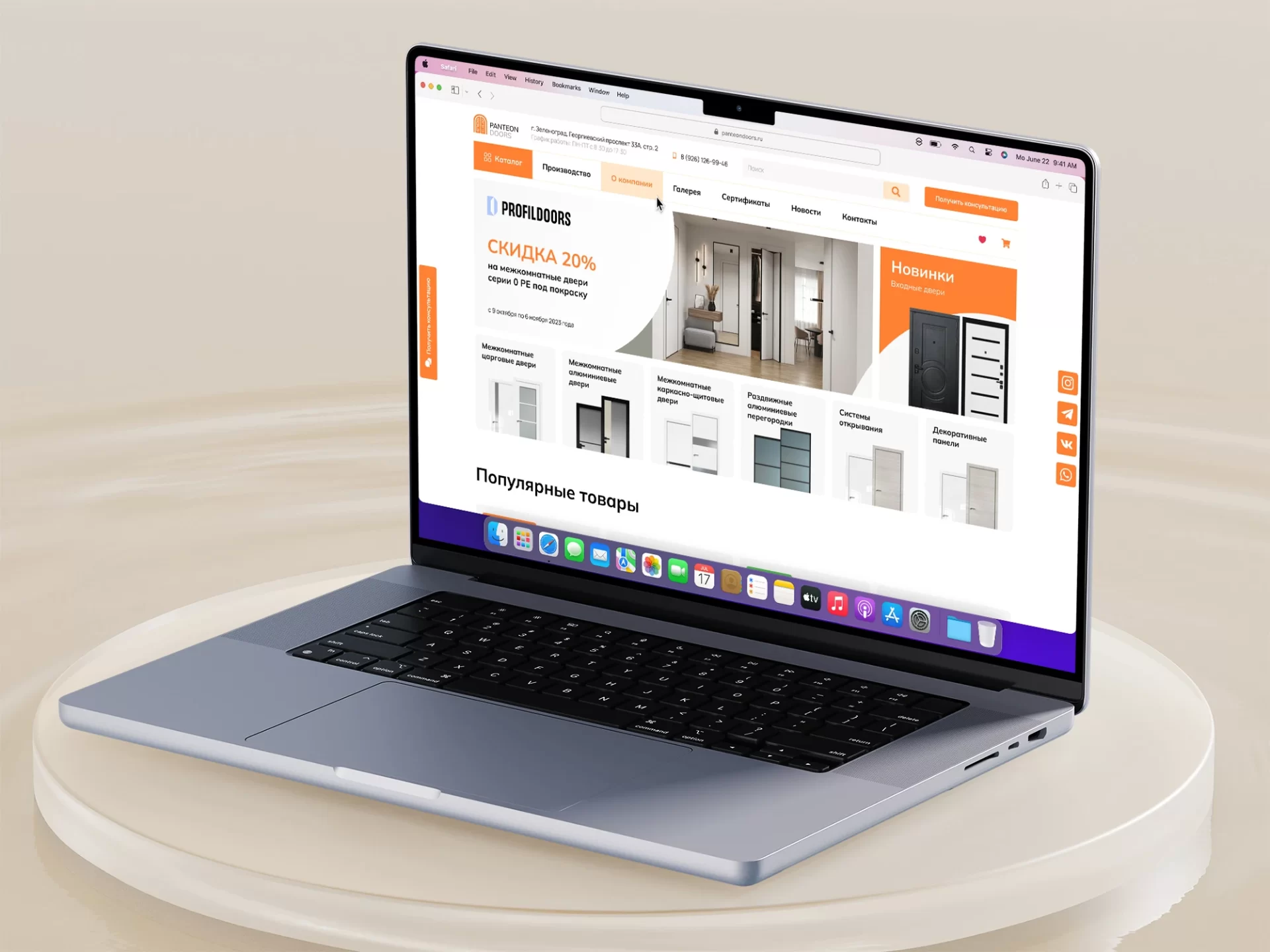
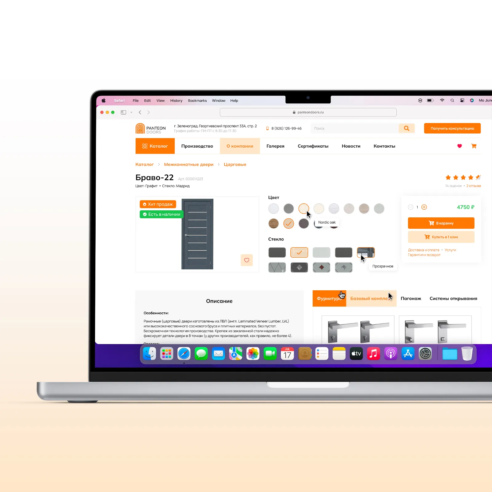
Develop a design in a strict style for the homepage and product card. Design the interface in such a way that it would not be loaded with unnecessary elements and would not cause discomfort when searching for the right product. Draw banners and create adaptive versions for mobile devices.
From the beginning, I needed to understand the target audience for an online door store in order to understand the needs of the users. Through research, I identified several groups of people who would be interested in buying doors and created user personas.
After working through the user personas, I realized who the main buyers of doors are. They are mostly middle-aged people of 25 years of age and predominantly male. Financially secure, who value their time.
Based on this, on the main page in the first screen were allocated categories with examples of doors, so that the user could quickly find a door from a huge number of options. Below it is a section with popular models so that the user can see which doors are popular at the moment.
This group is interested in purchasing high quality doors that will provide security and aesthetic satisfaction for their homes.
These users may be looking for unique and stylish doors that will emphasize the concept and design of their projects.
These professionals will be interested in bulk order door options or partnering with a store to provide services to their customers.
Door safety and security may be a priority for this group, so promoting doors with appropriate features (e.g., childproofing) will be relevant.

Before starting to design the interface, I conducted a study of competitors and identified several large stores with similar themes. During the analysis, I paid attention to the structure of the pages and the layout of the site elements. And also on the availability of search for a certain product and the number of steps that the user takes to find a product that will satisfy his need.
The collected information helped me to understand which sections of the site are prioritized over others and allowed me to evaluate the overall usability of the site.
| Background
#ffffff |
◯ |
|
R: 255 |
| Primary
#FF8133 |
◯ |
|
R: 255 |
| Accent
#FFE7CA |
◯ |
|
R: 255 |
| Text
#010101 |
◯ |
|
R: 1 |
Font family
Mulish
Usage
Tiles and subtitles

The Mulish font family is a modern and elegant font set designed with clarity and readability in mind. It includes different typefaces such as Regular, Medium, Semi-Bold and Bold, providing a wide range of variations for use in design. Mulish features a balanced design suitable for both printed materials and web pages, giving content a modern and professional look.

Font family
Manrope
Usage
Text

Manrope is a modern font family designed with an emphasis on cleanliness and readability. It includes several lettering styles such as Regular, Bold, ExtraBold and others, giving designers a wide range of choices to create different styles and levels of text emphasis. Manrope features a harmonious balance between modernity and functionality, making it suitable for use in a variety of design projects, including web design, print and mobile applications. The font features crisp shapes and easy-to-read letters, making it a versatile choice for various types of text content.


If you would like to contact me to discuss the design of your project or for any other reason